
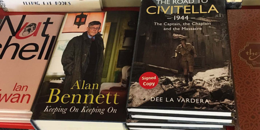
How nice to find oneself rubbing shoulders with Alan Bennett. On a bookshelf in a bookshop, that is. Copies of my book The Road to Civitella 1944 placed next to Bennett’s Keeping On – Keeping On. I have met the good man at a book signing at Bath Literature Festival a few years’ back, his signing, obviously, not mine, but that is as far as the connection goes. I love all of his work – that goes without saying.
I see that one book of Bennett’s is about the same width as three of mine. I’m sure Bennett’s is quality AND quantity and the word count must be more than 100,000. All the same, my book does look rather slim in comparison, even though it comes in at 90,000 words. The width is also due, I think, to smaller print and narrower line spacing, barely 1.5. In the front matter section of my book is printed:
Typeset in 10pt on 13pt Sabon
I’ve not heard of sabon. I know all the usual standard fonts and many of the unusual and obscure ones from scrolling through the wide choice available on Word. I’m not able to distinguish how sabon differs from other serif fonts; I don’t have an eye for such details. It’s not a font you’ll find on your computer but you can download it to have a look.
It’s funny how once you start looking up a subject online, however simple it might appear to be at first – quick look at wiki, follow a link or two – you suddenly find a whole other esoteric world open up. I found many websites dealing with fonts including
typedia
identifont
fontsinuse
myfonts
and a lot about sabon.
I even came across websites on the best fonts for tattooists – Fearless Script, Sailors Tattoo Pro and Bleeding Cowboys, three favourites on a top ten list.
‘Sabon is an Old Style serif typeface designed by Jan Tschichold and released in 1967. The design was influenced by the types of Claude Garamond with the italic taking inspiration from Robert Granjon, a contemporary of Garamond’s. It’s a quintessential body text serif that is popular in book design, however, it doesn’t seem to be used much on the web’ typewolf
And then I found out that
‘Sabon is considered to be one of the handsomest contemporary interpretations of Garamond’ garamond.culture
What a privilege that my publisher Fonthill Media chose a handsome font for me. Alan Bennett’s books may be thicker, but I wonder what typeface Faber & Faber used for his books? NB- it doesn’t give details in the front matter section of his books
A few years ago, Simon Garfield published Just My Type – a Book About Fonts which highlighted the wonderful world of fonts; a feast of a book for ‘font-spotters’. Next on my ever-increasing reading list.